
Imagine a world where charts hold the key to predicting market trends, identifying potential entry and exit points, and ultimately, maximizing your profit potential. Trading chart patterns can help you do just that. Whether you’re a novice trader looking to enhance your understanding of the markets or an experienced professional seeking to fine-tune your skills, chart patterns offer a valuable framework for making informed trading decisions.
In this comprehensive blog, we will delve deep into the world of trading chart patterns. We will define some most used and successful chart patterns you can use to increase your profitability and education. We will discuss Entry, Exit, Target and Stop Loss, all levels with complete live market examples here. So, stay tuned with us to improve your trading style.
If you want to know live updates of the market and want to learn charts live within market hours, join our telegram channel free of cost. There will be no fees charged in future also from our participants. Click on the link below and join now.
Buffett.Money
Head and Shoulders:
This pattern is a reversal pattern and consists of three peaks – a higher peak (head) between two lower peaks (shoulders). It suggests a shift from an uptrend to a downtrend because it is a bearish pattern. It consists of three peaks: a left shoulder, a higher head, and a right shoulder. The pattern indicates a reversal from an uptrend to a downtrend when the price breaks below the neckline.
The head between left and right shoulder should be higher than the shoulders and both shoulders should be almost equal. Entry in the stock will occur when the stock breaks the neckline and closes below that. Better will be if you enter after retesting the breakdown. Stop Loss should be at the high of the previous candle of the breakdown candle and the target should be in 1:2 or 1:3 risk reward ratio minimum.
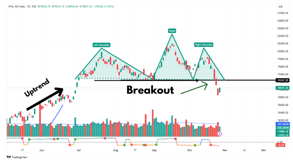
Inverted Head and Shoulder is a bullish pattern and will be vice versa of the pattern we discussed above.
Cup and Handle:
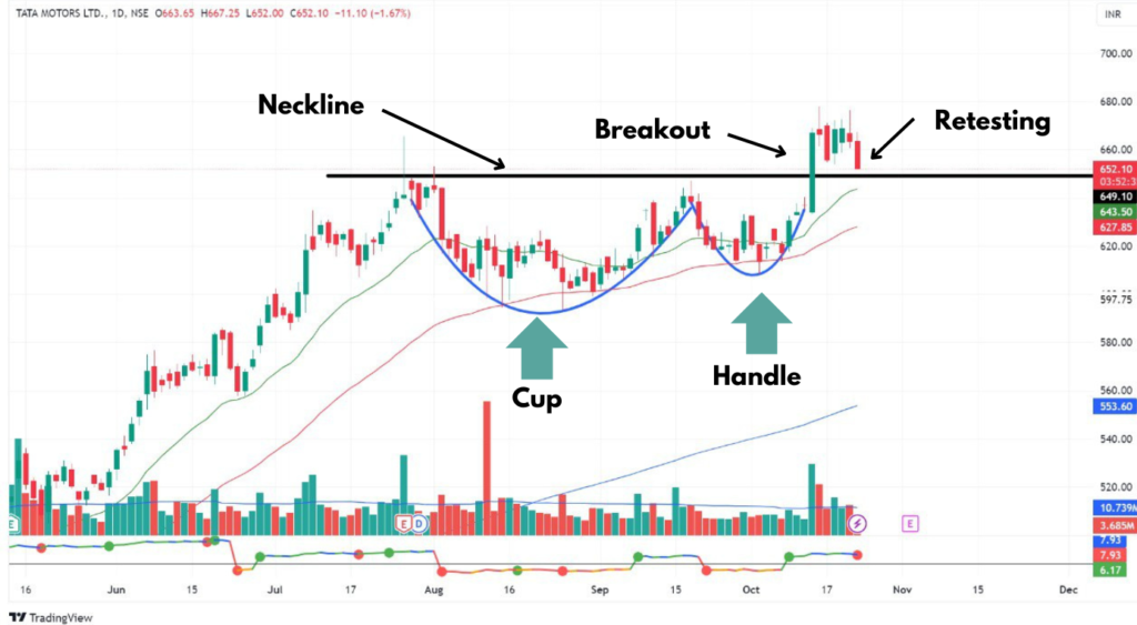
This trading chart pattern resembles a teacup and handle and is considered a bullish continuation pattern. It often occurs in longer-term trends. The cup and handle is a bullish continuation pattern. The “cup” forms a rounded, concave shape as prices decline, followed by a “handle” as prices consolidate in a smaller range. The breakout from the handle to the upside suggests a potential upward continuation of the existing trend.
This is one of the most trusted trading chart patterns and also the most founded pattern. If we talk about its Entry then it will occur when the stock breaks the range of the handle. But entry should only be taken if the stock is 2–4% above its breakout level and not more than that. Otherwise the risk reward ratio will not be in your favor. Stop Loss should be below the lower range of the handle and the target will be minimum 1:3 of the stop loss.
Flag and Pole :
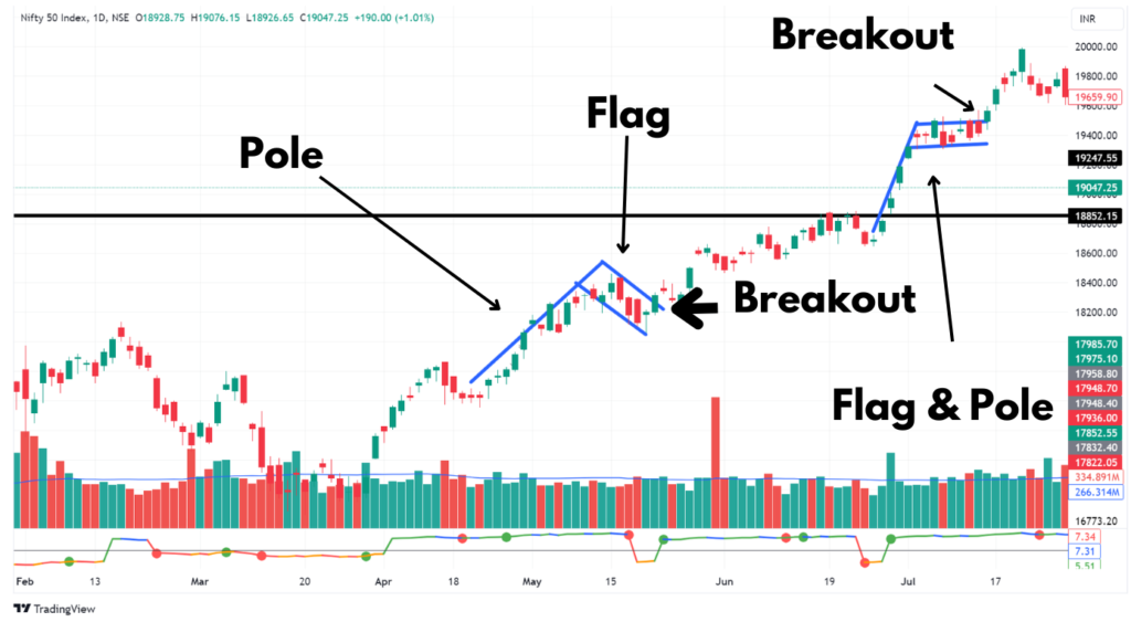
The “flag and pole” chart pattern is a continuation pattern that is often associated with strong and brief price movements followed by a period of consolidation. This pattern gets its name from its visual resemblance to a flag on a pole, with the “pole” representing the initial sharp price move, and the “flag” representing the subsequent consolidation.
This pattern is most found in the largecap stocks and Index. In this pattern first a stock gives a straight move and then consolidates in a range. After that consolidation when the stock breaks the upper range of the consolidation then it will be taken as a breakout. You should enter 2–4% above the breakout range of the stock. The target in the stock will be equal to the height of the pole and the Stop Loss will be below the range of the Flag. You can see in the image below.
Double Bottom:
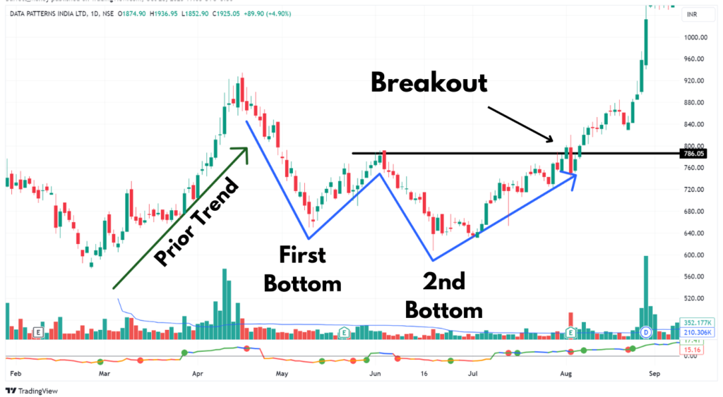
When a stock has given a good rally and then it falls back up to some level. Then it bounces back up to the previous high level and retraced back. This time it will again fall down and under-cut the recent low. The pattern should take almost 7 weeks or more to complete itself. And when the stock is falling, volumes should be less as compared to when it is increasing. It will become a “W” type pattern as you can see in the image below.
After forming a double bottom when it bounces volumes should be high. The breakout will occur once the stock breaks the upper resistance line. Entry level should be at the breakout or retest of the chart within 2–4% above the breakout range. The target here should be minimum 20% or equal to the second depth of the bottom from the neckline. Stop Loss should be below the breakout range and it should not exceed 8%.
Horizontal Base :
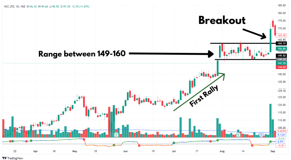
This is one of the most found trading chart patterns. Many times a stock gives a good move and after that it starts consolidating in a range depending on stock to stock (10–20%) for some weeks to some months. It is a pattern which gives 2nd buying opportunity to the missed once and also who has bought it on the first breakout, they can add it again to average UP a strong stock. The prior move of the stock should be a minimum of 25–30%.
The volumes during the consolidation should be less as compared to the volumes during the up move. This is one of the most simple trading chart patterns to identify. The Entry level should be on the breakout of the range on the upper side with volume, within 2–4% range above the breakout level. The target you can take here is 20%++ and if the market trend is in Uptrend then it can go up to 50%++ easily. The stop loss should be below the breakout levels and maximum it should be 8%.
Conclusion :
In conclusion, trading chart patterns are valuable tools for technical analysis that provide traders with visual representations of market sentiment and potential price movements. These patterns can be found in various financial markets and timeframes, offering insights into potential trend reversals, continuations, and market psychology.
It’s important to remember that trading involves inherent risks, and not all patterns lead to profitable trades. Therefore, risk management and disciplined trading strategies are essential when incorporating chart patterns into your trading approach. Additionally, understanding the general market trend, staying informed about economic events and news, and constantly honing your analytical skills are all critical components of successful trading. If you use these patterns in the bull run then these can give you returns which you can’t imagine.
If you want to study these patterns with us in the live market then join our telegram channel. It is FREE for our readers and otherwise we charge a monthly premium. Link is given below. Join now and see the change in your trading style.
Buffett.Money
Learn More :
You can learn some stocks which can be good for trading/invest in the coming period. Even you can back test that how good the stocks performed in past which shared by us. By your trust you can join our telegram channel BUFFETT.MONEY so that you can continue your learning.
- Best EV stocks to invest now!
- Best stocks under 100 Rs. in the Indian Stock Market
- Best stocks to buy today in October
- 10 best shares to buy today !
- Will the Stock Market crash Now!
Thank you for reading Buffett Money’s guide on 5 Best Trading Chart Pattern! To keep learning and developing your knowledge of financial analysis, we highly recommend the additional resources below:
- Penny Stock
- High Growth Stocks
- Dividend Yield Stocks
- False Breakout Stocks
- Fundamentally strong stocks
- Importance of Paper Trading
- Importance of Trading Journal
- AI impact on Algo Trading
- Averaging Down Strategy
- Moving Average Strategy
- Bulk Deal Strategy
- Methods of Stock Market Prediction
This is all for information and education purpose. Research yourself or ask your financial advisor before any investing decision. All data given above is as per the closing price of 20 Oct 23.
Thank You
Happy Investing



081277216081277216081277216081277216081277216081277216081277216081277216081277216081277216081277216081277216081277216081277216081277216081277216081277216081277216081277216081277216081277216081277216081277216081277216081277216081277216081277216081277216081277216081277216
Nice explanation. I love the pattern.